
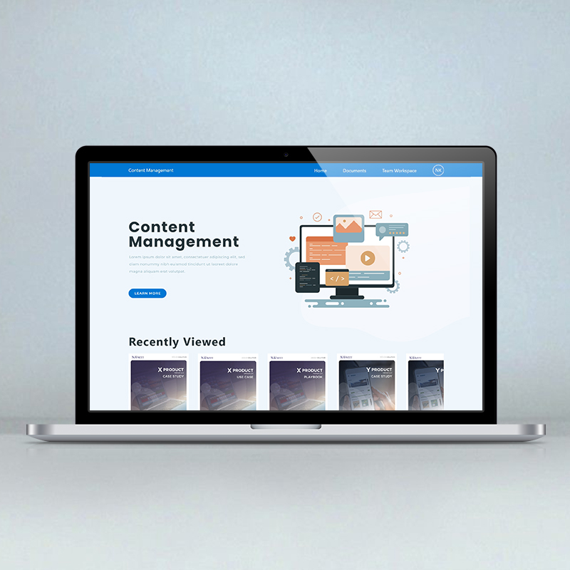
CMS Platform
A content management platform redesigned around one goal: let non-technical teams publish confidently without a support ticket.
Powerful software that nobody wanted to open.
EDIT: The existing CMS was functional but intimidating — dense screens, unclear hierarchy, and a learning curve that slowed teams down. The brief was a full UI redesign focused on clarity and confidence, not just a visual refresh.
Mapping the real workflow before touching a single screen.
EDIT: Walk through your UX process — user flows, wireframes, information architecture decisions, and how the visual design supported the underlying workflow.
Replace this with a real client quote, or a line that sums up what made this project click.
A platform that finally got out of its users' way.
EDIT: Summarize the outcome — usability improvements, client feedback, or adoption metrics if available.
Also on Behance — view the original gallery